Sculpting the Void: My Signature B&W Lightroom Workflow

For me, editing isn't about fixing a "bad" photo; it's about refining the intention. I use Lightroom CC for one primary reason: flow. I typically begin the heavy lifting on my laptop where I can see every pore of the concrete, but the flexibility to sync with my mobile app for the final export is indispensable. It turns the editing process into a continuous conversation with the work, regardless of where I am.
The Foundation: RAW and Ratio
Every journey starts with the RAW file. You’ll notice the image is already locked into a 4:5 crop. This isn't just for Instagram's real estate; it’s a deliberate choice that forces a tighter, more intentional geometry. I always apply an Auto Upright transform immediately—in street photography, if your vertical lines aren't true, the urban illusion falls apart.

Click to view larger
The Power of Profiles vs. The B&W Button + Light and Curve

You might wonder why I don't just hit the "Black & White" button and move the sliders. I start with the B&W Red Filter v2 profile because it provides a sophisticated, non-destructive baseline. Unlike the manual mixer, profiles often contain 3D Look-Up Tables (LUTs) that handle color transitions more smoothly. This prevents "banding" in the sky and artifacts in the shadows, giving me a silver-screen starting point that manual sliders alone can't replicate. In the Light panel, my goal is to control the dynamic range. I’ve pulled the Highlights (-52) back to recover detail in the bright building panels, while bumping the Shadows (+20) to ensure the subject doesn't disappear into a total silhouette. The Point Curve is where the "CP" soul is sealed—a slight lift of the black point creates those misty, film-like shadows that feel less digital and more like a darkroom print.
The B&W Mixer: Sculpting Luminance

Even in monochrome, we are still manipulating the underlying color data to create depth. In the B&W Mixer, I treat colors as physical light. I’ve significantly darkened the Greens (-27), Yellows (-23), and Oranges (-19) to add grit and perceived "weight" to the building's texture. By pulling these sliders down, I separate the subject from the architecture, ensuring the concrete feels dense and the shadows feel intentional.
Color Grading: Infusing the Atmosphere

To achieve that signature "Cold Contrast" look, I move away from a neutral gray using the Color Grading panel. I push a subtle teal/blue tint into both the Shadows and Highlights, while shifting the Balance to +45. This creates a cinematic, almost icy mood that mimics the feel of early morning light in an urban landscape.
Effects: Texture Without Digital "Crunch"
The Effects panel is where the tactile feel happens. I increase Texture (+18) to make the facade feel like stone, but I counter it with a negative Clarity (-9). This "blooms" the highlights slightly, preventing the image from looking too sharp or "over-edited". I finish with a Vignette (-22) and a hint of Grain (10). Notably, I skip all Manual Noise Reduction to maintain a natural, street-style aesthetic.
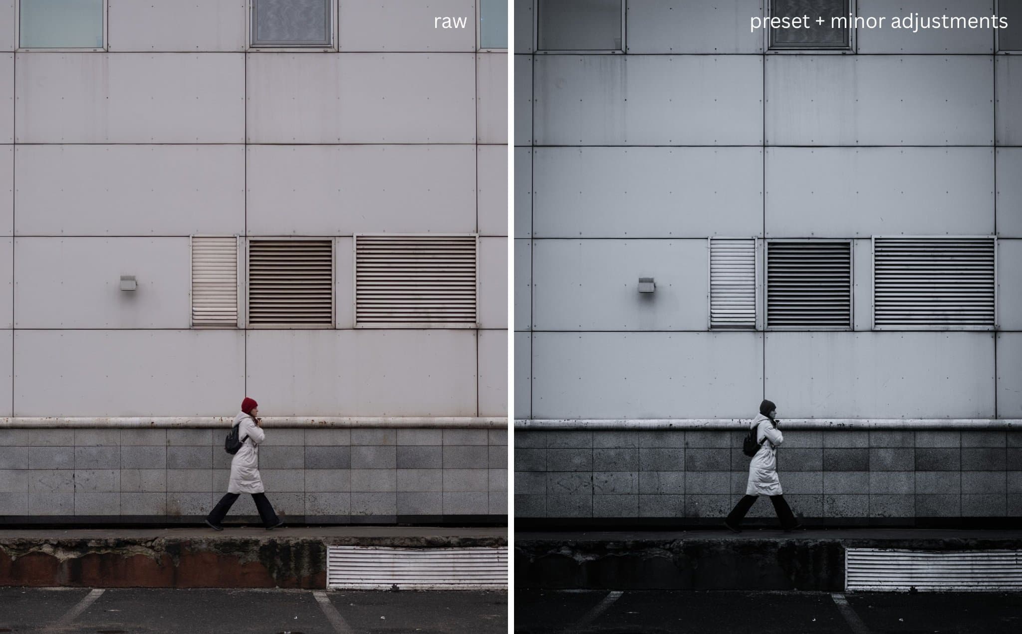
The Transformation: RAW vs. Global Preset
It is helpful to see exactly how much work the global preset does before moving into surgical adjustments. On the left is the flat, unedited RAW; on the right is the image after applying my profile and global adjustments. The depth is established, but it still lacks the final focus that only masking can provide.
Click to view larger
Masking: The Final Sculpt
Global adjustments are just the beginning; I use masks to act as a digital "dodger and burner". I applied a Top-Down Linear Gradient to underexpose the upper facade, drawing the eye downward. This is balanced by a Bottom-Up Gradient to recover details in the street. Finally, a Radial Gradient centered on the subject with an exposure boost of +0.44 acts as a spotlight, ensuring the human element is the heart of the frame.

Click to view larger

Click to view larger

Click to view larger

Click to view larger
The Final Evolution: RAW vs. The Finished Piece
This is the true journey of the image. By comparing the original RAW file to the final version, you can see how the combination of global profiles and intentional masking transforms a simple street scene into a focused, atmospheric study of geometry and solitude.

Click to view larger
I’m making this preset available for free download below. However, treat this as a starting point, not a destination. Use it to understand how these tones are mapped, but use your own imagination and style to create your own visual identity. Every street corner has a different light; use this to find yours. The camera sees the light, but the editor chooses where it falls.
The Final Touch
The final step happens on the mobile app. I use the mobile-exclusive border feature in Lightroom CC to add that clean, gallery-style frame. It provides the image with the "breathing room" it needs before it hits the world of social media. You can check the final version on

Click to view larger